
This is my submission for XDrive Photo Lesson 10 – Black & White.
Every week, I look forward to reading Raj’s photography lesson, wondering what his new subject would be. This week is “Black and White”. Immediately, I thought of those portraits I’d taken a couple of weeks ago. Those would be great in black and white, I thought.
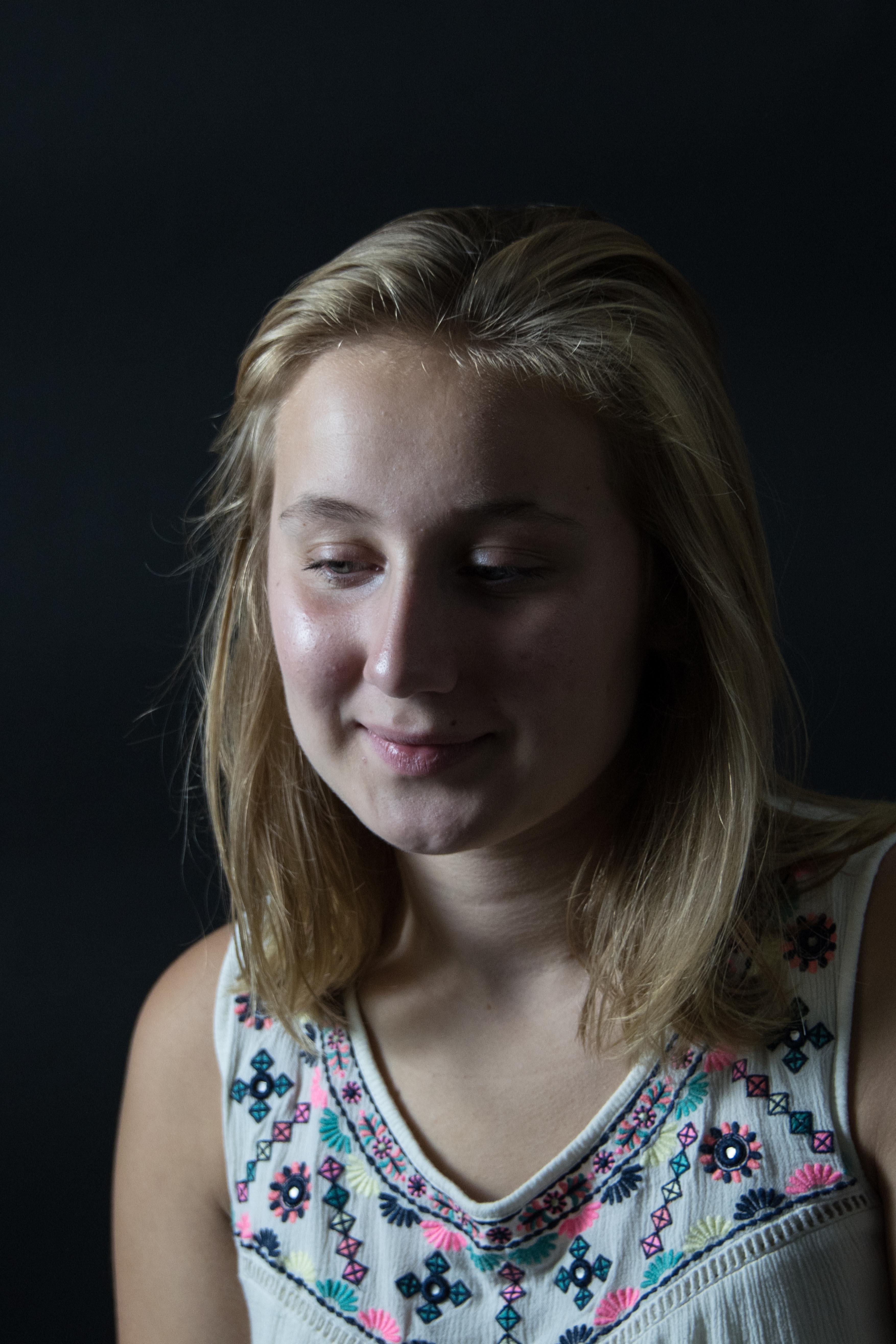
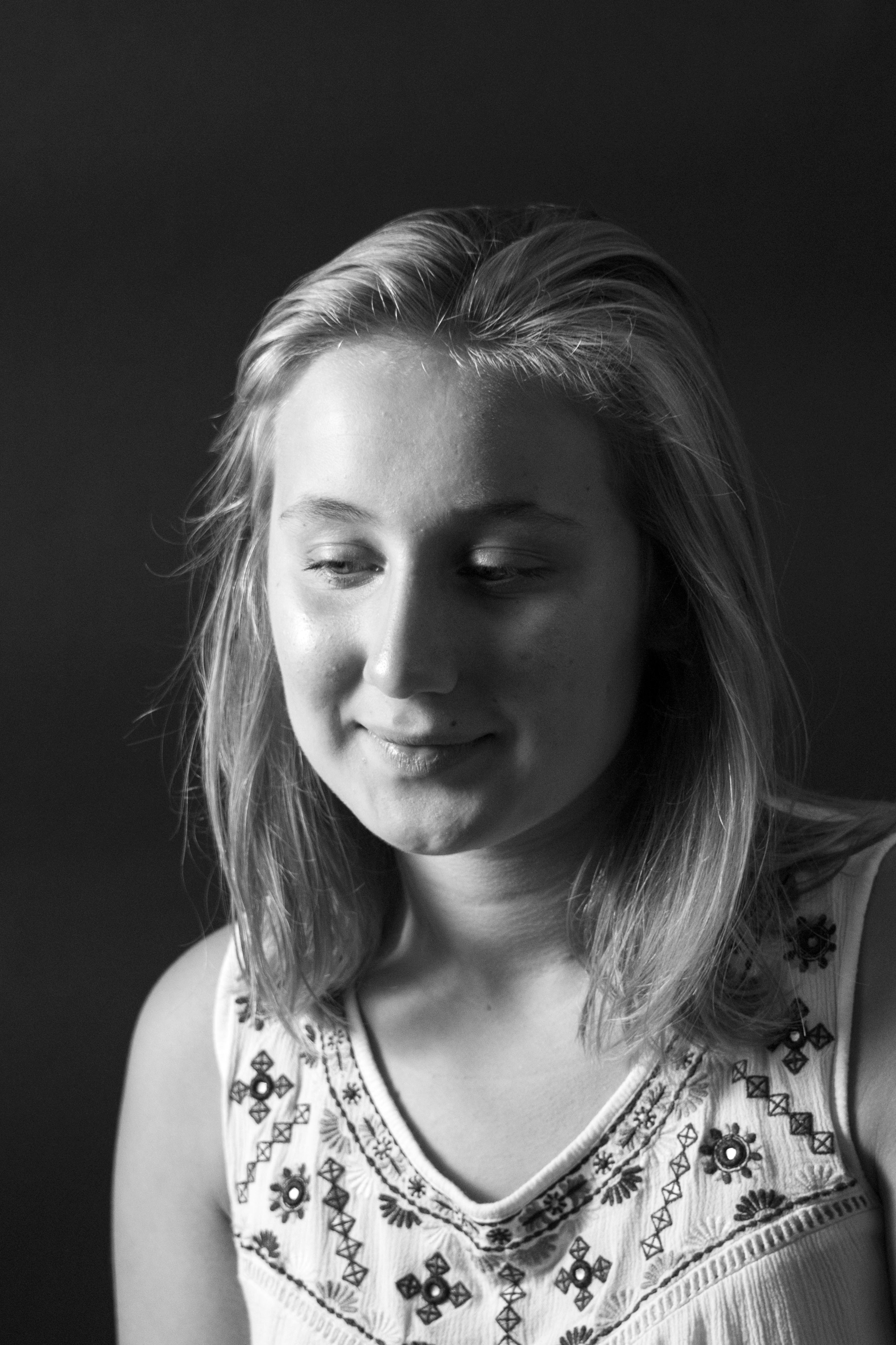
(F/5, 1/60, ISO-320, 85mm)
For me, the biggest challenge for converting a color photo to a B/W is balancing the contrast. Everyone has different taste for contrast. For example, comparing to me, my husband prefers lower contrast photos. So contrast is one thing we seldom discuss ;-).
Sometime, I couldn’t even agree with myself. I would set the contrast exactly the way I wanted and only found out, on the next day, that I should tone down (or up) a little. And a day later, I might switch back again. Is this another thing that needs time to get better?
After reading Raj’s lesson, usually, I would find a couple more articles to read, and, maybe, watch a couple of videos on the same subject. This would reinforce what I have learned from the lesson and once in a while, I may even learn something new. Anyway, one photographer said that saturation is our friend when converting a color photo to a B/W. (I wish I could remember who ;-(

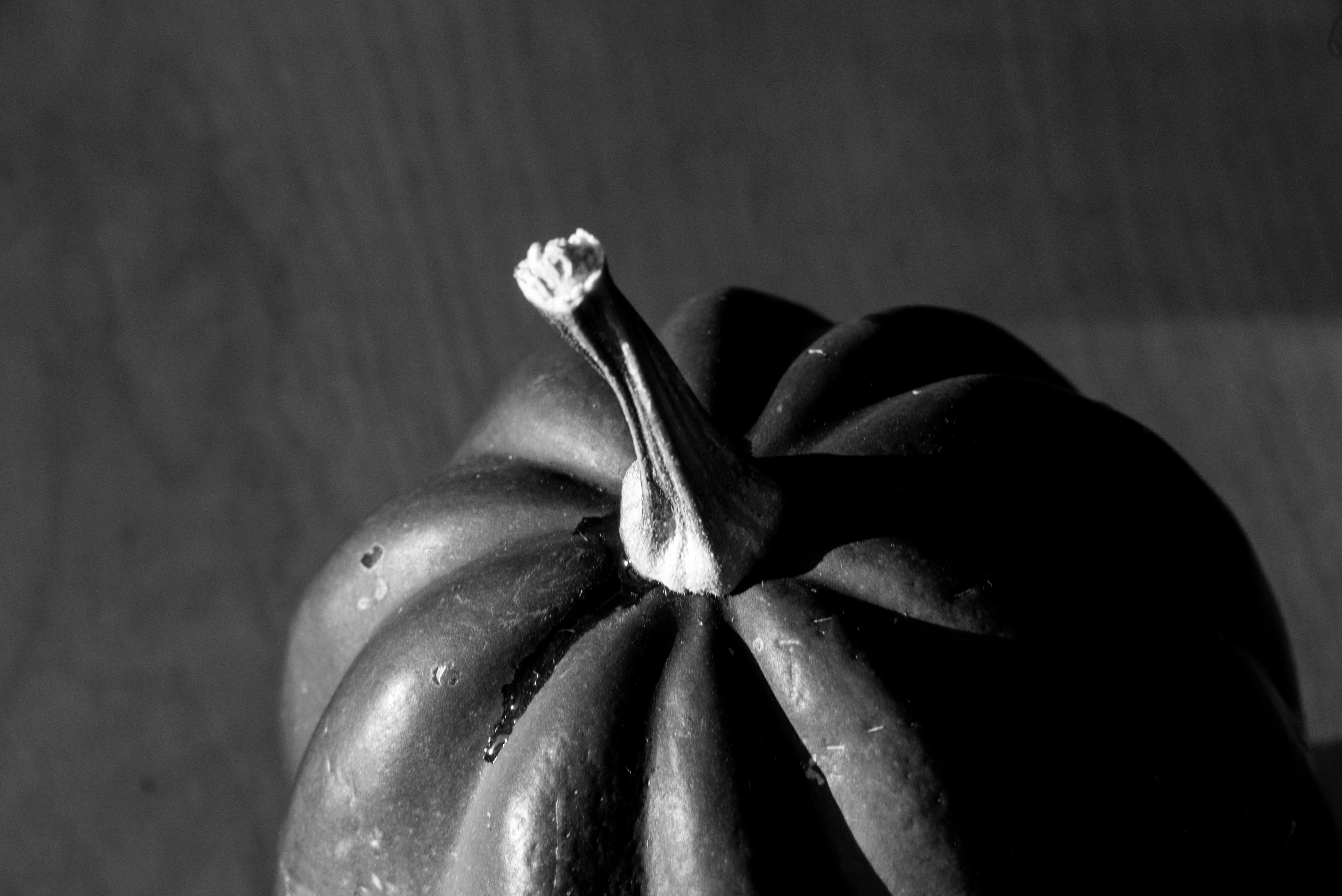
(F/13, 1/25 Sec., ISO-200, 105 mm)
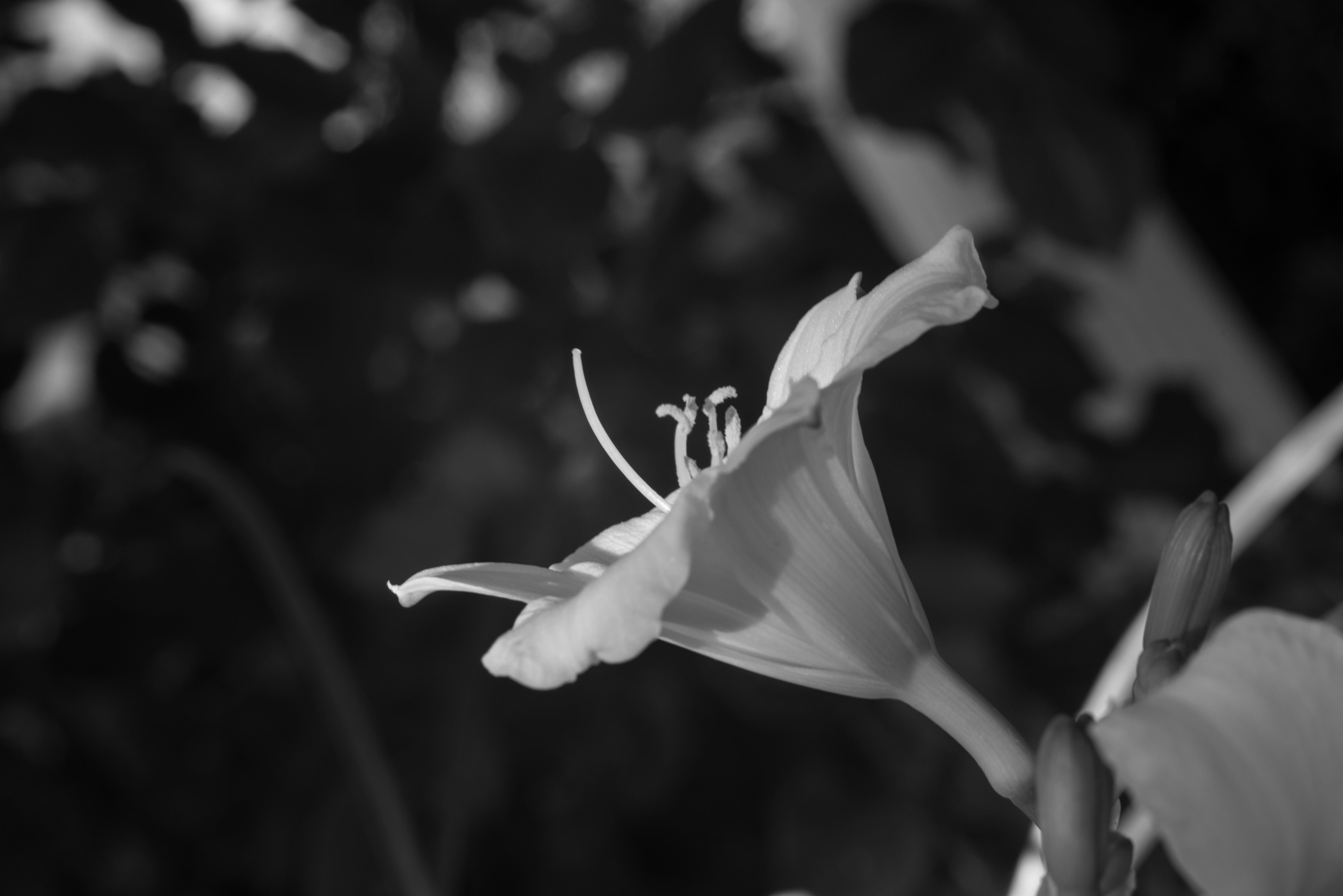

On the second B/W photo, I’ve increased the saturation before converting and that was the only difference between this B/W and the above. I don’t know if it’s easy for you to see. I do like B/W #2 better. If you look at the flower bud on the right, you can see that it has more detail on this photo than the one before.
Raj has shown us several examples on when not to convert to B/W. Those examples are very helpful. However, sometimes, you may be surprised.
Fall is finally here. The soy and corn fields look beautiful. I took the following photo with my iPhone for the purpose of studying/remembering the light and the color (in other words, please forget about the composition… ;-).
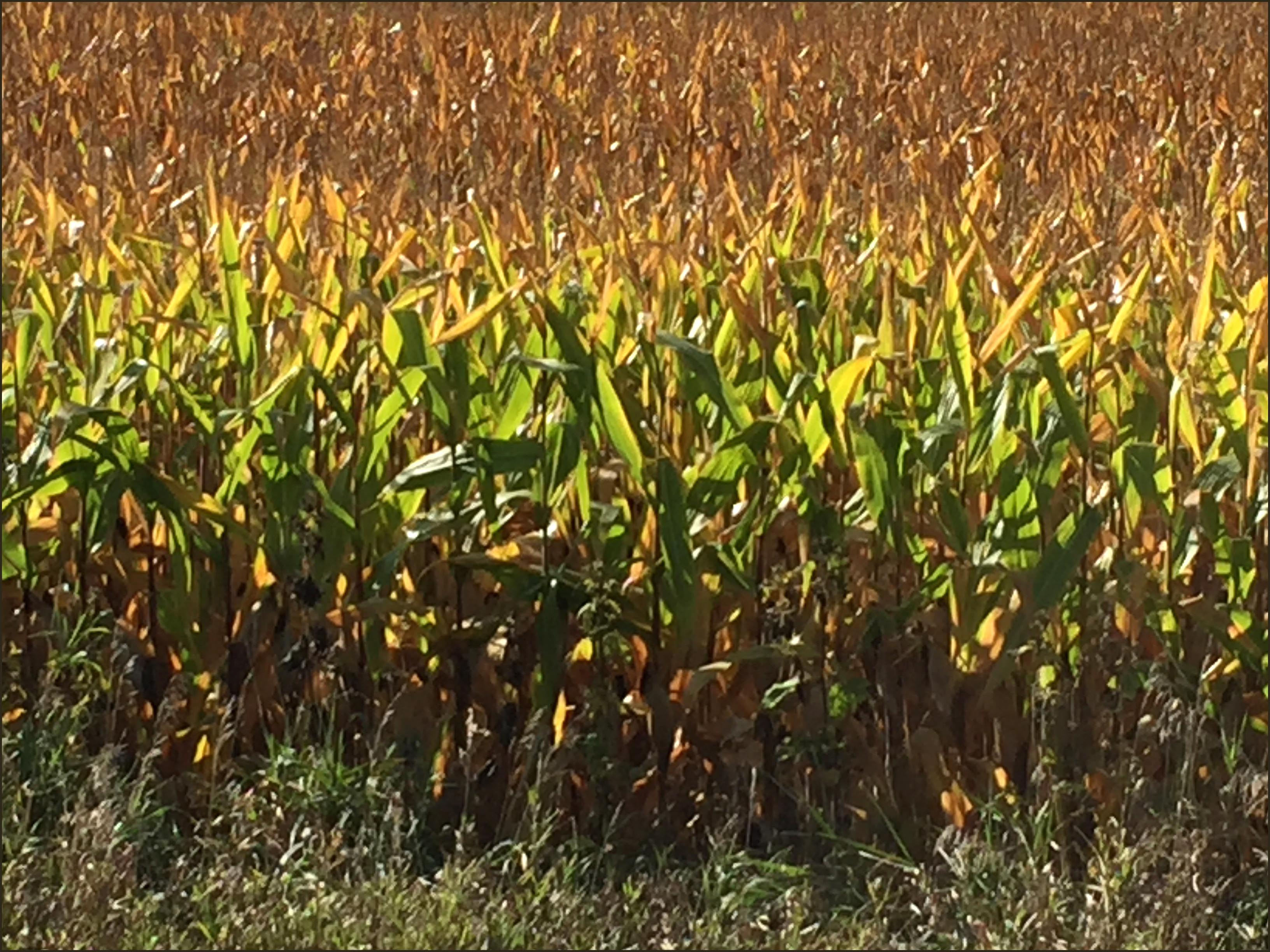
Since I took the photo because I liked the color, there seemed no reason to convert it to B/W, except that Raj’s lesson this week is about B/W. So I converted it anyway… just to see.
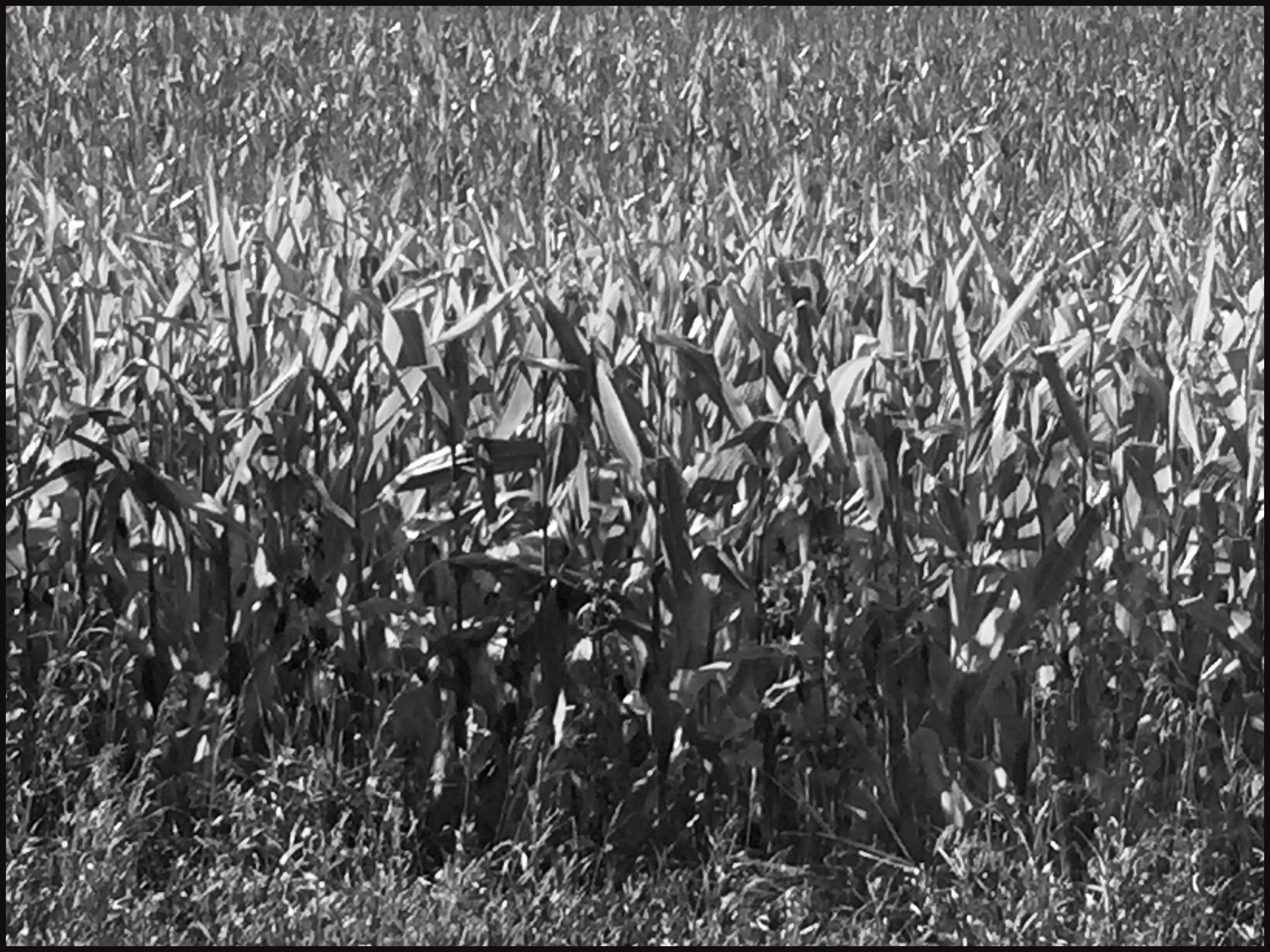
To my surprise, this B/W photo reminds me of an abstract painting I had seen at the modern art museum. I quickly took another look at the original colored photo; I don’t get that abstract feeling at all. Maybe it’s just me… I often like both color and B/W version of the same photo. I like each for a different reason. (By the way, do you see lots of birds… 😉
Can you stand for one more?
(F/18, 1/30 Sec., ISO-1000, 300 mm)
Thanks for visiting my blog.

soy and corn field in colour.. tops the list for me.
LikeLiked by 1 person
Thank you, Dymoon. Ah, it’s soy field instead of soy bean field 😉 Thanks.
I was wondering if people knew how those fields look in fall. I am so glad that you like them too.
Good night.
LikeLike
Beautiful pics Helen!!!
LikeLiked by 1 person
Thank you, Paulo. I appreciate your comment.
Good night.
LikeLiked by 1 person
Your pumpkin in B&W is so much better than mine! I see exactly what you mean about B&W #2 on the flower. I immediately liked that one better than the first–subtle detail, but a detail nonetheless. And your model in B&W is beautiful, Helen. I don’t know if it is a quietness or what, but I really like it–and I am usually a color kinda’ gal!
LikeLiked by 2 people
Thanks, Lois. I am glad that you can see the difference between those two B&W photos. It was an interesting discovery. Who would know that the saturation would make such difference!
For me, B&W photo is more dramatic and more dimensional. It’s difficult to compare the two. 😉
Good night.
LikeLike
Thanks Helen for your contribution for the week. I was waiting for your submission. Not to give my critique, but to learn something from it.
Pic 1: Beautiful portrait of your neighbour, I think I have met her before! 😀 Both colour and B&W have their own advantages here. She has excellent skin tones which are evident in the colour which B&W misses, but she also has a beautiful expression. The lights and shadows are creating a great portrait here, that is the highlight of the B&W. In the end, I think I like the B&W.
Pic 2: You are right the saturation has given the better details on the bud which is a great thing. White flower in the blackish background looks beautiful in comparison to the colour version. But, if you look at the subject(flower), 2nd B&W version kind of overexposed. Parts of the petals look blown out. One should be careful about the blown out areas. In this case, since you are shooting a flower, you have to make sure flower is properly exposed. If possible try the same pic again trying to enhance the details and see if you can make some difference. But the main problem here is the sharpness, slower shutter speed has resulted in the unsharp picture here, so any post-processing is not going to make much difference.
Pic 3: The the story of a colour version is “Layers” where you showcase the different layers of colour and the depth created by them, whereas the B&W is mostly artwork. Here viewers are going t look at the lines and texture it creates. So the storyline is “Texture”. This illustration probably is the best example to show how things change drastically with the choice of colours.
Pic 4: Great shot once again, shadows and lights are the essence of B&W most of the times. Only needed light grey background. The shadows could be lifted a bit to show the shades of grey that the pitch black.
This critical review is part of XDrive’s photography learning session. Thanks for being here.
Raj
LikeLiked by 2 people
Thank you so much, Raj. I didn’t expect seeing your critique so soon. From reading viewers’ comments, I began to realize that I wasn’t the only one who was anxiously waiting for your comments, and that makes me appreciate your quick response even more. ;-).
It usually takes me several days to post, but that is a good thing because I allow myself to take time to study your lesson thoroughly. This actually is a luxury thing, which I couldn’t afford before retiring.
Pic 1: I like the B&W better, too. You have an excellent point about skin tones, which I didn’t think of. A lot of time, I know I like a photo, but I couldn’t pinpoint what I like about. In other words, I have an instinct, but instincts need to be processed in order to become knowledge, and your comment provides that magic to make it happen. Thank you.
Pic 2: This photo was taken for lesson 8 before reading your comment on shutter speed. 😉 After learning about what saturation can do in converting the photo to B&W, I randomly picked this photo to test it out. I was afraid of the difference would be too subtle to be recognized, so I increased the saturation to the maximum, which I probably wouldn’t do if it wasn’t a test. 😉
After reading your comment, I tried it again; this time I only increase saturation for all colors a small amount, and increase saturation for green and red a little more. The flower looks much better. I really like all the details that were added to the photo.
Lesson learned: even though I was concentrating on testing how saturation works when converting a photo to B&W, I shouldn’t always pay attention to the whole photo 😉
Pic 3: Excellent points! I may add that all of those color layers make it difficult for viewers to see the whole picture at once. In my mind, I see each layer separately.
Pic 4: You were right (of course 😉 After lifting the shadows, I darkened the background. I do like it better this way. 😉
Thanks again.
LikeLiked by 2 people
B&W is not easy to convert… I like your set of BW, Helen, especially the first and the last one. I always look forward to your photo lesson submissions. 🙂
Have a wonderful weekend. 🙂
LikeLiked by 2 people
Good morning, Amy. Thank you for your comment. I look forward to your submission too. Your photos always give me something to think about.
I like the way how you summarize the lesson in the beginning. I don’t know if you can tell that you have influenced how I wrote mine. And a couple of time, after reading your submission I had to go back to read the lesson again. Ha ha ha.
Have a wonderful weekend. (Weekend is almost gone, right? I am in that everyday is Sat. mode 😉
LikeLiked by 1 person
Appreciate your nice comment, Helen. I do the same though my my submission comes ahead of yours. It inspiring to learn as a blog community, a
LikeLiked by 1 person
Oops! I hit the reply by accident. I meant to say … your photo skills and knowledge are way ahead of me. Good to have you here. 🙂
LikeLiked by 1 person
Thanks, Amy. I was debating if I should write a post on learning photographing. I wonder if my experience would help others. At the end, I think maybe I would just share it with you for now. 😉
Remember a few months ago I wrote that my husband was upset with me when I introduced myself as a beginner? One thing good about me is that I knew how much I knew. 😉 I was a beginner at that time; I wasn’t trying to be humble. Anyway, I think my turning point came when I decided to go through each of my camera settings one evening. Only after that, I became “knowing” my camera, and suddenly from a “clicker”, I became an “operator”. And only after I became more familiar with operating my camera, I could really think about creating. Not sure if all of this would make sense to you. Everyone is different. Going through each setting and practicing using manual mode help me a lot.
Thank you for all the supports you have given to so many of us!
Good night.
LikeLiked by 2 people
Hope you would write a post on your experience. I think my problem is that I don’t practice enough to remember what I read, also the tripod is not utilized, so I depend on Av.
Thank you, Helen so much for sharing this with me. 🙂
LikeLiked by 1 person
Helen, you are learning a lot from this exercises. My favorite is the first, works best in your portrait.
LikeLiked by 2 people
Thank you, Sally. Yes, I have learned a lot and I am so happy 😉 Now I just need to come up with a project so I can contribute 😉
Good night.
LikeLike
I’m sure that you will.
LikeLiked by 1 person
Pingback: Learn Photography – 10 – Black & White – XDrive
I think the saturation tip was good. And the corn field does look like abstract art in b&w. 😊
LikeLiked by 1 person
Thank you, Robin. I have found a lot of free good photographing advice on Internet — for that, I am grateful. 😉
Good night.
LikeLiked by 1 person
hi Helen, wonderful photos as usual! i’m back blogging, just posted my first post today! i’d love that you visit my new site. 🙂
LikeLiked by 1 person
Thank you for letting me know that you are back blogging, Elizabeth. I have read several of your new posts already and enjoyed all of them. And I am looking forward to reading more.
have a wonderful evening.
LikeLike
I love the feel that comes from a black and white photo, timeless is what it is🙂
LikeLiked by 1 person
Thank you for your comment. I like B&W photos, but I began to see why some photos are better in colors. Still, I think most can be B&W. Ha.
Have a wonderful evening.
LikeLike