
This is my submission for Brenda’s A Photo Study: Rule of Thirds.
Brenda said, “Photography is an art form and as such need not rely on rules. Yet, it is important for the photographer to keep in mind that the composition rules help create balanced, dynamic, and interesting images that invite a viewer to stay and visit in comfort.”
Before I say anything about rules, I want to share a story with you. When I took my first photographing workshop, I kept receiving one particular feedback from my instructor: “try not to place the subject in the center.”
His words stayed in my mind long after the workshop was over, and the rule of the third became the RULE for me even when taking portraits.
One day my husband said to me, “Why do you always place your subject off the center? It doesn’t look good.”
“I like it that way,” I said, even though, deep down, I do feel that particular portrait with an off-center model looked odd.
I continued following the rule of thirds for more than a year, and, slowly, I began to realize I knew exactly how I wanted my photos to look.
Now go back to what Brenda said about creating balanced, dynamic, and interesting images… my guess is that each of us may have a different definition/idea for “balance, dynamic, and interesting” and because of that, we have our own unique photographing styles.
Thinking back, those days, when I followed rule-of-thirds diligently, had given me a better understanding of how I would create balanced photos. Some of my photos may still look a little weird, but that is more “by-design” nowadays 😉
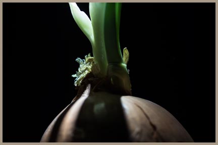
I took the following American flag photo through mini-blinds. The gap was very small, which made it difficult to focus. I was happy how it turned out.

Which one of the following two do you like better? I like how the left one looks, but the right one gives me more “alone” feeling.
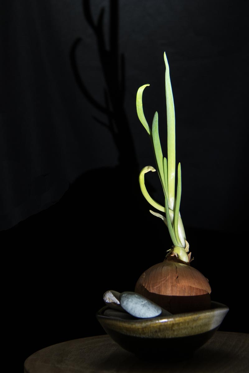
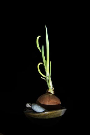
Which one of the next two do you think is more balanced?

Finally… cropping tool, for me, is quite useful for composition. I often move the cropping grid all over my photo to find out which composition I like better.
Thanks, Brenda!
Thank you for visiting my blog.

Great post. In the first group, I like the one on the right better. The lighting is great. For the single onion, I like the first one. Being slightly off center leads the eye to different areas of the picture.
LikeLiked by 2 people
Thanks, Marie. In the first group, I am not 100% sure. It’s kind of depending on my mood 😉 On the second group, I, too, like the first one better. For me, this is better balanced even though it was not centered (I find this interesting. 😉
Have a great day.
LikeLiked by 1 person
I must admit I prefer off centre even though I don’t know the rule.
LikeLiked by 2 people
Some people have better instinct! 😉 Not many people had cameras when I was young, and whenever someone took a photo, as far as I could remember, he usually placed the subject in the middle. I guess I just assumed that that was what I should do. Ha.
Have a great evening.
LikeLiked by 1 person
Great post. It demonstrates that this is not a one-size-fits-all rule. I’ve been treating it more as a guideline and often take multiple shots of the same thing using different composition. I admit though that off-centre photos generally work more often for me than not. That might be because I don’t often take photos of people. People I generally prefer to be featured prominently in the centre.
LikeLiked by 2 people
Thanks, Joanne. I agree with you that most of the time, off-center photos look better. Portrait, however, is the other way around, like you said. I had a good laugh when I go back to look those off-center portraits 😉 Of course, I am not talking about all cases, but most cases.
(Making mistakes is fun 😉
Have a great day.
LikeLiked by 1 person
Our mistakes certainly provide us with interesting learning 🙂
LikeLiked by 2 people
This was fun to read, Helen, because growing up I always remember being told to center my subject. Made sense, but what did I know. Now I am such a fan of the rule of thirds. That said, in the first photo I do like the onion centered. In the cropped photo, I like the off-center. Really–I love the black background!
LikeLiked by 2 people
Thanks, Lois. I have a hard time to decide which one I like better in the first group. I think… it depends on my mood 😉 The second group, I, do like the off-centered one. It looks more balanced to me 😉 For me, the centered one seems a little too heavy on the left side.
When did you start photographing? Not many people had a camera when I was young, so I started very late.
Have a great day.
LikeLiked by 1 person
I was 13 and using an old Brownie Hawkeye. I just loved capturing images. My first 35mm camera was a Pentax SLR, which I still have. I really should have progressed by now…… 🙂
LikeLiked by 2 people
Wow, Lois, no wonder you could easily catch those memorable moments! Now I know… 😉
Good night.
LikeLike
So beautifully captured, Helen. Great lighting, wow!
LikeLiked by 2 people
Thanks, Amy. Want know my secret? I really really like to play with the pen light (not sure how to call it. Look like a pen and it is quite powerful.) With that light, I can see how it looks like before shooting, and since the light is more focused, the result is more dramatic, I think.
Have a great day.
LikeLiked by 1 person
Thank you for sharing your cool images with us!
Enjoy your day.
LikeLiked by 1 person
Rule of thirds, as all rules, is made to be broken at times. I like your photo of that flag through the blinds.
LikeLiked by 2 people
Thanks, Hien. You are right that rules are made to be broken at times. It’s hard to know when to break it, isn’t it? More interestingly, I wasn’t aware that I was breaking it when I did. 😉
I love flags. Every time I see one, I think about taking a photo of it 😉
Have a great day.
LikeLike
For me, today, the off center photos are a bit more appealing. I like the shadows on the onion. The flag through the blinds is fascinating. How ever did you do it????
LikeLiked by 2 people
Thanks, Carol. The flag — I was walking in downtown when I saw the flag. I like odd photos ,so it caught my attention immediately.
The shadows — I have a pen light (look like a pen, but it is a powerful flashlight). It’s fun to play with it. (Only $25 😉
Have a great day.
LikeLiked by 1 person
Yes, I like those odd photos, too. Such an unusual view of the flag.
LikeLiked by 1 person
Thank you for joining me…the flag image is amazing and has me wondering if it is a metaphor for today’s political climate. Your questions invite me to stop and ponder the various elements of composition within images that I find myself drawn to…is it easy on my eyes because it complied with a rule or is it the creative play with space, light, shadow, color, tone, perspective, etc? Your images also have me pondering if there is a connection between the line intersections and a possible different point of interest for the photographer and the viewer?
LikeLiked by 2 people
Recently I was asked to give a short talk on before and after learning LamRim. I knew I had changed somewhat, but I didn’t know I had changed a lot. And you know what? Your photo study helped me to evaluate my progress in photographing. Now I know… 😉
When I like a photo, it’s more because of the creative play with space, light, shadow, color, tone… etc. But when I dislike a photo, the first thing I check is the rule of the thirds 😉
Photographers, writers… we can’t create anything from viewer’s point of view, can we? It’s possible our point of interest is different from our viewers — that we have to let it be, I think 😉
Have a great day.
LikeLiked by 1 person
Yes!🙏🏻
LikeLiked by 2 people
Well done, once you follow the rules. It’s time to break them.
LikeLiked by 2 people
Thank you, Sally. I find out that I don’t worry about rules as much as before; I just focus on creating something I like to see 😉
Have a great day.
LikeLike
The Rule of Thirds is debatable. Have to agree that sometimes it works and other times it doesn’t. Love your perspective with the flag. With the onion, I do agree that the right one looks more alone, like it’s thrust into the spotlight. But I think I like the left one better because you can see the thing that it’s resting on and doesn’t look ‘floating’. I think centered close-ups are shots that usually work out.
Most of the time I like to use the rule of thirds when I have a single subject. But when I’m wanting to showcase both foreground and background, then I might consider putting the foreground subject in the centre.
LikeLiked by 1 person
Thanks, Mabel. I feel that I am still finding my way and you are already at (or past) my destination. 😉 What you said makes a lot of sense to me. Thank you. (I want your brain!!!)
LikeLiked by 1 person
agree. the right photo creates more “isolating sound.”
it depends… 法無定法~ ^^
LikeLiked by 1 person
Thank you, Lady Oscar. It depends – that’s how I feel a lot of time. Could it be I am too flexible? Hmm…
LikeLiked by 1 person
Dear, how are you?
it is always nice to be flexible — we usually don’t have such “freedom” to do it. Now, we can do it! ^^
LikeLiked by 1 person
I like the pictures off centered. I think the negative space adds more to the ‘feel’ of the picture. And I do that too Brenda – crop and move it all around until it ‘feels’ right to me. Love the play on light and shadow in your pictures 😊
LikeLiked by 1 person
Thanks, Kelly. Nice to know you do that too — crop and move it around until it “feels” right . (Great description, by the way 😉
Stayed away from blogging for a month, I have a lot to catch up. I don’t want to miss your posts…
Have a wonderful day.
LikeLiked by 1 person
I have been pretty busy Helen, haven’t been posting much…hoping to sneak in a bit of time here and there for it. Take care 🙂
LikeLike
So beautiful Helen!!!
LikeLiked by 2 people
Thank you, Paulo.
LikeLike
Oh this is good! I just love the flag … Now for the other questions. I think the shot on the right is more balanced and I see that it is centered. Again too I think the last shot is more balanced, in the middle. So there we go! Did I help 😃
LikeLiked by 2 people
Thanks, Julie. Your comment helps. It’s interesting how we see things, isn’t it? This experience makes me realize each of us is an unique individual. Ha.
Have a great day.
LikeLiked by 1 person
On my camera viewfinder, I have activated the grid that splits both vertical & horizontal into thirds…it is a good rule, and while can (should) be broken at times, always good to keep in mind. Great shot of the flag, really a stunner. AS for the two shots, I like them off-center: left and top… so opposite of Julie, and she has a great eye for composition so take her advice! 🙂
LikeLiked by 1 person
Thanks, Randall. It’s interesting how each of us would prefer a different photo in two shots. This experience makes me wonder if art is subjective. I googled and to my surprised, there are a lot of articles discussing this subject. I guess I will be busy reading for a while.
Have a great day.
LikeLike
I wonder who said not to place the subject in the center?… I really like the photo of the flag. Such a different and cool view. As for the two other images: Of course there are no rules, and personally I do like the centered versions better here.
LikeLiked by 1 person
Thank you, Otto. Ha ha ha…See I did take your words seriously.
I began to realize that in one workshop, one can only learn this much. Not placing the subject in the center is, actually, a good rule for the first workshop. It took me a while to learn when not to place the subject in the middle. This experience makes me humble — there is a difference between “I know it” and “I really got it”.
Have a wonderful day.
LikeLiked by 1 person