
This is my submission for XDrive Photo Lesson 16 – Contrasts.
Shortly after I started looking at other photographers’ photos online (a few years ago), I became a big fan for some photographers; I wowed at every photo they posted. It took me a long time to figure out that all those photos had something in common; they are all high contrast photos — I figured that out after one of my admired photographers commented on one of my photos saying “add more contrast!” 😉
So, high contrast was a good thing, I thought. I started pushing the contrast to the upper limit to all my photos; I thought, for sure, I got it. But my husband didn’t like my high contrast photos. “Too much contrast!” he often told me. We argued, and then each continued his own way.
To my surprise, 6 months later, I got tired of my high contrast photos. Quietly, I toned it down somewhat, and I am happier with my photos now. 😉
Raj said, “Now the question is, I am supposed to have more or less contrast in my picture? Well, the answer is “its left to you”. You choose the contrast levels based on the picture or the story you are going to be telling.”
Raj is right, of course. I just want to add that based on my experience, “it’s left for me” doesn’t make it easier for me. It takes time to figure out what my story really is (and what my photographing voice is)… maybe because we have many layers?
Here are 3 photos I selected for this assignment.


Raj is focus on the tonal contrast in this lesson. I like to include one color contrast photo because I have determined to take some new photos for each lesson 😉 (Yellow and violet are on the opposite side of color wheel.)

Thanks for visiting my blog.

Hi Helen – I love that Raj said “its left to you” and this is something we all should remember – and when I used to teach students about contrasting colors- I usually mentioned the LA Lakers for violet/yellow- or had a photo of an iris.
and so your photo for that was beautiful and personal – love the circle theme and the little gem of your faith.
oh and the roofers’ photo reminded me of a museum installation.
LikeLiked by 2 people
Thanks, Yvette. I, too, believe that the artist has the final saying for the art piece she is creating 😉 Still, it’s nice to hear everyone’s feedback. Quite often, I would miss an important point or two 😉 It’s harder to get to know myself than I thought. My understanding of me keeps changing. Ha.
Have a wonderful evening.
LikeLiked by 1 person
hope you have a nice night too – 🙂
LikeLiked by 1 person
Well, it didn’t start well, but it will be okay. In my next life… 😉
LikeLiked by 1 person
ha – you are funny (and so fun) and I will be back soon to check in a little better – xxoo
LikeLiked by 1 person
Beautiful pics Helen!!!
LikeLiked by 1 person
Thanks, Paulo. I tried to pick the better ones 😉
Have a wonderful evening.
LikeLike
A beautiful set of photos, Helen! It’s hard for me to decide how much contrast to add to my photos. Yours are perfect.
LikeLiked by 1 person
Thanks, Amy. Me, too, it’s hard to decide how much contrast. One day I would apply this much and felt very happy with it, but the next day I might change it back to the way it was before. And that makes it fun, I think.
Have a great evening.
LikeLiked by 1 person
Thanks Helen for the contribution! It’s always a pleasure to see what you come up with. You never disappoint!
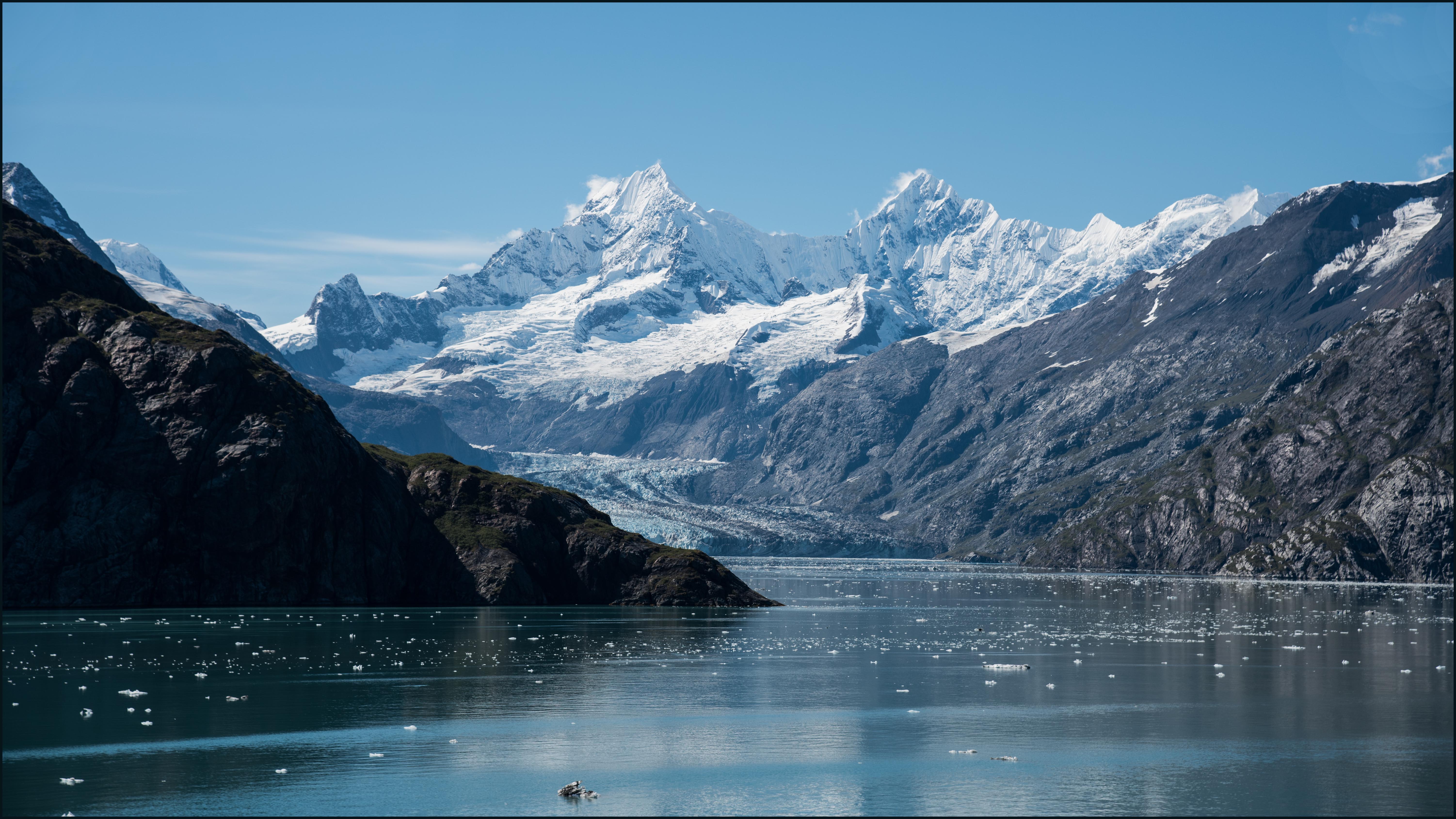
Pic1: Perfect shoot of a heavenly scene! The right amount of contrast and other adjustments done. Great details and hope people will see it in full quality.
Pic 2: Another perfect shot here in my view. Chain and the lock with the background of “blurred” house, perfect story. The right choice of monochrome, I feel colours would have taken away the story. Contrast is just rightly applied.
Pic 3: Silhouette of men at work, nice candid attempt. But I feel the black and white would have worked better here, also needed some rim light effect by enhancing the highlights. The punchiness is not there in this picture for me. Some empty space on the right side could be cropped off.
Pic4: Nice colour contrasts captured showcases the prayer theme! Yes, such colours give great clarity to the picture because of the added contrast created by the choice of colours. Since showcasing the vividness is the story, probably you could have tried to put everything in focus?
Overall, great work Helen. Really useful to anyone trying to understand and learn about photography. Your contributions clearly show the advantages and importance of taking the good pictures right from the camera. Post processing is just a routine one does to enhance already a good capture. Not to fix the shooting error.
This critique is part of XDrive’s photography learning sessions. Thanks Helen for being here.
Raj
LikeLiked by 1 person
Thank you for your comment, Raj. Congratulations for receiving a teaching award. Being your student is such a blessing. Thanks for taking time teaching us and allowing us to be ourselves.
Pic 3: I was hoping you would comment on this photo. It does have a little rim light, but is that enough? When I increased the highlight, the sky was brightened, too, which bothered me. B&W does make sense, since there aren’t too many colors in this photo. And the empty space on the right definitely could be cropped off.
What is punchiness?
(I did convert it to B&W and tried to increase the highlight. It still doesn’t speak to me. Maybe this is one of those hopeless photos?)
Pic 4: Since the beads have many bright colors, I was afraid that the photo would become too complicated if I put everything in focus, but it sure worth to give it a try (so I can see). Maybe shooting with different DOF is a good idea, too.
I appreciate your comment, Raj. Good night.
LikeLiked by 1 person
Thanks Helen for your kind words, well that award was a couple of years back. That was special because that was from students! Nothing can beat that feeling huh?
Pic3: I think in this pic you can go B&W and it doesn’t matter if it blows the sky as the sky is clear and no clouds. But its just a suggestion based on my imagination. When you actually process it as you said it might not be appealing to you.
Punchiness I referred is photo being, crisp and clear immediately for the viewer. The main subject should come out of the picture. Here, men at work, the roof and the leaves all take centre stage.
Pic 4: Yes I was talking about different DOF here.
Cheers!
LikeLiked by 1 person
I am not surprised. I know we all like your lessons! 😉
If I didn’t reply your comment, it is because I have replied in my head a couple of times. Sometime, I get confused what I have done with what I have done in my head. 😉
Thanks again for making everything clear for me. The more I think about it, maybe pic 3 didn’t speak to me from the beginning so no matter what I do, I wouldn’t be able to fully connect to it 😉
Our neighbor asked us to shoot some Christmas photos for her family. Almost every photo I have to increase contrasts to make it look good for me 😉 Good thing you just taught us how important this is.
Have a wonderful day!
LikeLiked by 1 person
That’s great Helen. Glad to to know that its helping you all. As a matter of fact even I learn a lot because of your questions and clarifications… Thank you for being here!
LikeLiked by 1 person
Pingback: XDrive Photography Learning – 16 – Contrasts. – XDrive
Beautiful images Helen. Sometimes I also have dilemma about the level of contrast but as Raj said, “choice is ours”.
BTW, I love your first image.
LikeLiked by 2 people
Thank you, Rupali. For me, taking good photos, requires luck 😉 The light was perfect that day when the Alaska cruise ship drove by that scenic area. It rained the day before so we didn’t get any good photos for Denali Park. ;-(
Have a wonderful day.
LikeLike
Pingback: xdrive photography learning – 16 – contrasts – meditative journey with saldage
truly interesting. In music, we have the concept of “tonal contrast” as well. In fact, when I taught yesterday, I was even explaining “contrast” in dynamics, tone colors, … to my students!
LikeLiked by 1 person
What you said is very interesting to me. I have never thought of that way about music 😉 Thanks.
LikeLiked by 1 person
Pingback: XDrive Photography Learning – Review – Nov – XDrive
I used to turn up my contrast too ..in fact, I did loads of horrid things to photos that make me cringe now. 😃 Yours are wonderful Helen .. I just love the lock
LikeLiked by 1 person
Thank you, Julie. I hope you didn’t do what I did… when I was still in that high-contrast mode, I took some photos of some people I used to work with, and later gave the photos to them. No one said a word to me – no nice-photo, no thank-you. I thought they were kind of rude. Later when I took another look at those photos, I realized how terrible they looked 😉 Oh well, I learned to forgive myself. Ha.
Have a wonderful day.
LikeLiked by 1 person
Oh no, this made me laugh! No I’ve never done that .. but I can just imagine. No thanks, no nice photo … lol, cause they weren’t. Hilarious .. have a wonderful day right back at you!
LikeLiked by 1 person